🆓 All website code and content is available under open source licenses: Github 🆓
The Story So Far
This website has been a work in progress since… At least back in 2019. It may not look like that much, because really it’s not. The biggest challenge that I found in the “building a personal website” project wasn’t the website itself, but making it personal. This version took me a couple months to figure out. However, along the way I went through many learning curves of trying on different outfits, different styles, and different frameworks, some of which I’ll share as screenshots below.


The first image, which sports the header “vvill.ga”, was one of my more
eccentric designs I created back in high school. The binary in the background is
programmed to repeat until it goes off screen, and it decodes to “PRESS SHIFT
SPACE”. My plan was to have shift+space redirect to a video game made with
Javascript and a canvas element (my bread & butter at the time) which would act
as an alternative way to move between posts.
The second image is the homepage I created for my server space at Oregon State
University. It was originally written near the end of 2021 and is still hosted
here. It was created to be a
portfolio site like vvill.dev is now, as a week-long final project for an
introduction to engineering class. CSS was not in the rubric…
VVill.ga
My very first domain name might always be my favorite. .ga was one of the few
TLDs that you could register a free domain name from for a long time. And it
also just so happened to be the first two letters of my last name! Unfortunately
(Or fortunately, I haven’t looked into the politics of it), the country of Gabon
from which the .ga TLD originated, experienced a coup
and took back all of their domains for the country’s use. This lead to my
purchase of vvill.dev in August of 2023.
P.S. The website I used to get my free domain was Freenom.
Unfortunately, in March of 2023, they were sued by Meta and were forced to stop
allowing new domains to be registered. Someone posted an alternatives list
to the Freenom subreddit for other opportunities to get a free domain name, and
I’m particularly fond of the github subdomain options. Any option here will
give you limited control and reliability however.
A paid domain is only about $10 a year, which I’d suggest moving to as soon as
you can. My preferred domain registrar is Cloudflare
because they are (to my knowledge) the only ones who don’t charge any extra
registration fees. The “tradeoff” is that you have to use their DNS for your
domain, but that would have been a no-brainer anyways.
Site Structure
If you’d like to read the code that makes up this website, you’re in luck! All of my code is GNU GPL licensed and hosted on Github. I wrote a README.md file that should walk you through the purpose of each folder and file if you are not familiar with Hugo websites. Please read my code and learn from it. If you have any questions or suggestions, leave an issue and I’ll get back to you as soon as I can!
Home Page
Compiled, the home page looks like quite big, but it’s really just a sum of
parts. For example, the cards for About, Projects, and Blog are each brought in
from the card partial file which I’ll talk about next. The footer is also a
partial, as is the head tag, so they are reused across all pages on my site.
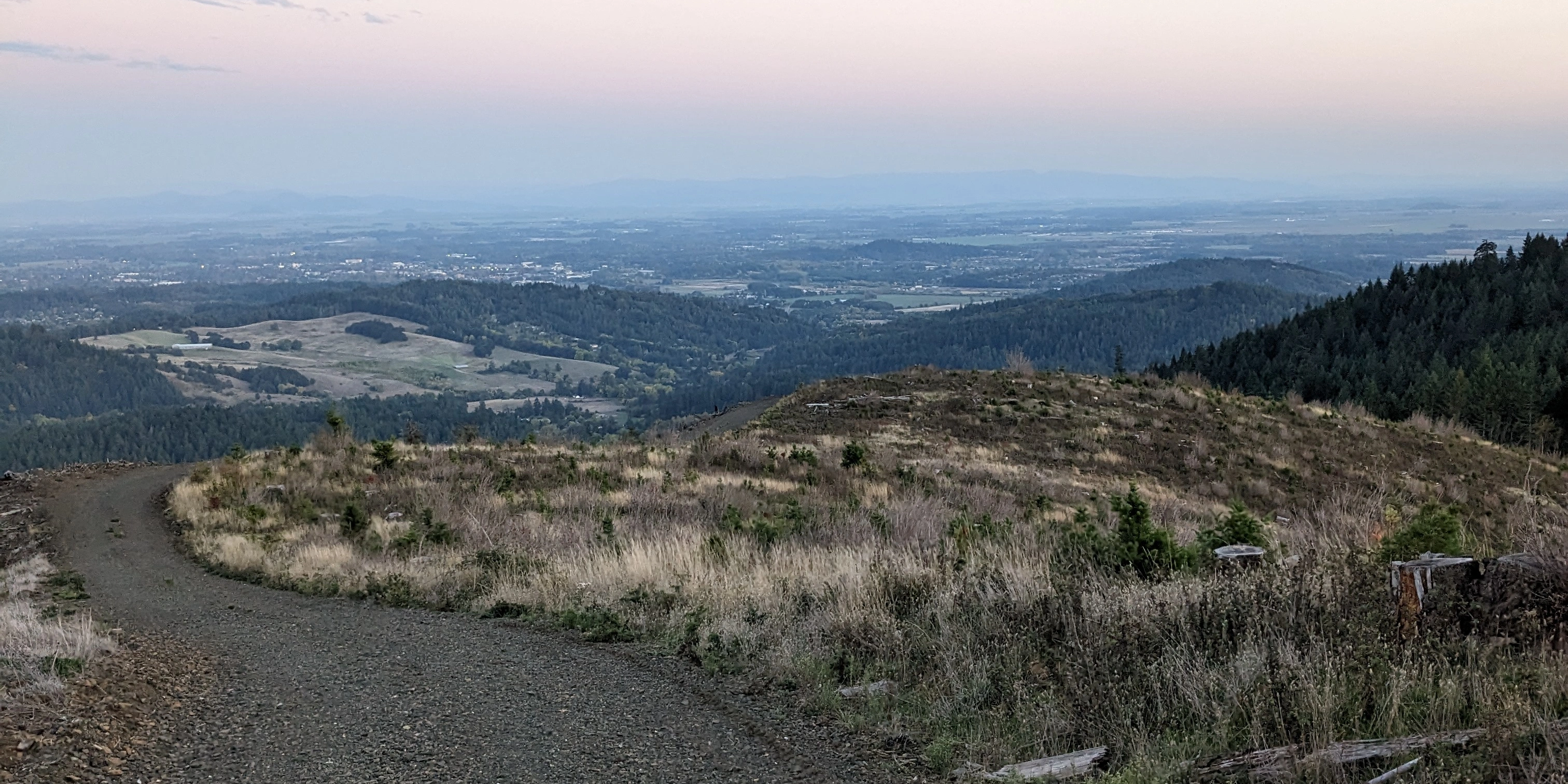
The first thing you’ll notice looking at the home page is the full screen
backdrop, or “hero image”. I took that on top of a ridge just outside Corvallis,
Oregon! I wanted to pin this image on the center of the left edge of the screen,
so that the gravel road would always be visible. This was pretty simple, with
a full-width div with display: flex and align-items: center. The message in
the middle of the screen is pretty cool looking too, and that’s just the css
backdrop-filter: blur(1em) at work, with a border-radius and box-shadow to
define it better. That box is actually where Hugo puts the parsed markdown
content for the page. Across the top there’s a fun little command line ticker
which I talk more about down in Favorite Features, and my
social links as icons (which line up horizontally on desktop and vertically on
mobile).
Scrolling down, the image fades into a sticky nav bar, and you start to see some
website content. The gradient into the nav bar was actually pretty tricky, not
because of the modulated transparency (it’s just background: linear-gradient(0deg, var(--0), transparent)),
but getting it to stick to the top of the nav bar and the bottom of the screen.
I talk a bit about that in the CSS Variables section later.
Everything interesting beyond that point is the Card Partial.
Card Partial
One of Hugo’s features is having modules you can plug in to different html files
called partials. I utilized this functionality to make a card that displays
posts of a certain category (or Section, as Hugo calls them). The main
attraction here is the custom-built dropdown menu which I don’t think I’ve seen
anything like before elsewhere.
On a mobile device (or portrait mode,
really), there is a dropdown with a little arrow beneath the card header, which
you can click on to expand the list and chose from the various post titles. On a
landscape screen, the items all fall down to the left of the post summary, and
you can simply click on each title to see more. It is also programmed such that
once I have thousands of projects to show off and blog posts written, you can
scroll down in the dropdown or in the left panel to see all the well spaced
options.
Everything gets defined in a Hugo for loop in the html file which pulls out and
organizes all the necessary information about each post. There is one simple
JavaScript function I wrote to handle the switching of content and the dropdown
menu.
In addition to the home page, the card partial also makes an appearance on the
never-linked-to list page. If you remove the last part from this url (i.e. go to
vvill.dev/projects), you’ll find a page similar to the post page,
but with a card on it which shows off all my projects.
Post Page
You’re looking at the post page right now! This is much simpler than the home
page html-wise, but it’s got a lot more specific styling to format all the
content generated from the markdown.
My CSS for this website is split into 3 files. classes.css define some classes
I made, for example for my card partial, that I may use in different cases, but
does not affect content unless it’s specifically requested. single_style.css
and index_style.css interact with element ids and general element rules to
specifically style the post pages and home page respectively.
Design Principles
Every website has different priorities and stylistic preferences. For example, I decided to build the Bonita Rose Jewelry site using the Square Online CMS because of the company’s low technological resources, their previous integrations with the company, and their need to quickly update product information from an easy to use graphical interface. For vvill.dev, my priorities were to make it personal, and to reflect my own values of simplicity, modularity, and style.
Simplicity
My value in simplicity stems from a childhood of satellite internet and loathing for bloated and slow websites. My website would be free of heavy libraries and frameworks like Bootstrap that shipped more that what was required. Additionally, as a tinkerer, I hold value in hand-written, human readable code. My Javascript functions are simple and to the point, and all ids and class names are consistent add context instead of confusing the reader.
Modularity
While plain HTML is great, writing DRY (Don’t Repeat Yourself) code makes me
feel amazing. I should only have to go through writing the website once, and
then write content and make updates with ease. This is where Hugo’s static site
generation comes in. After I designed the overall website, I was able to easily
convert my html files into templates for Hugo to read and assemble from content
written in markdown files.
Modularity is a beautiful thing. For example, if I want to add another section
to my website (About, Projects, etc), all I need to do is make a new directory
with some markdown files in it and put it in the content directory, and Hugo
will do the rest! This will make it easy for me to come back and add more
content to my website as I gain more experience and complete more projects.
Me-ity
Simplicity, Modularity, and Me…ity. My final design principle was
simply to do whatever I wanted to! I see this website as a reflection of my
self, so I took as much care in making it as I could. Some people may not like
the colors, but I do. I took them from Gruvbox, my favorite vim color scheme.
The segmented paragraphs might also not be everyone’s liking, but I find them
much easier to read and keep track of. Rest assured, this website was made for
me. I am fully capable of following and logically extending corporate style
guides. Yes, hiring manager, I’m talking to you.😁
Beyond surface level things like color schemes though, one decision that was
influenced by me-ity was my decision against using a framework or library. I
wanted to know and understand all of the code that made up my website, and
unless I’m writing the framework as well, that would’ve been nearly impossible.
Favorite Features
Command Line
I think my favorite part of this site is the cycling command line at the top of
the screen. It’s a very simple function set to run at a fixed interval to type
out a command, wait a bit, and erase it again. The commands come from an array
filled with common or funny commands that I’ve used. I have some fun commands
like neofetch in there, as well as some super useful ones like :(){ :|:& };:
(For legal reasons, I must spoil the joke. The second command is a fork bomb.
I do not advise running it.)
CSS Variables
I have 7 css variables in play on my site. Four of them are colors, from 0 to 3 in lightness. This made it very easy for me to change the colors of my page while designing it, and I didn’t have to remember specific color codes either. The color variables cover everything except the icon images. I might compile those into a font file later so I can color them on the fly after I’ve decided I’m done designing them. Aside from the icons, if you would like to make my website look like it is owned by Discord, you could throw this in the inspector:
/* Discord Theme */

:root{
  --0: #7289DA;
  --1: #2C2F33;
  --2: #23272a;
  --3: #ffffff;
}
Another two variables are used for fonts, my soft and round “blog-font” and my
monospaced “code-font” (both of which I may be replacing soon with GitHub’s new
Monaspace font), and the last one --vh is a constantly calculated height unit
that takes into account the changing of the bottom bar on some mobile browsers.
For some reason, it was impossible to get the gradient at the bottom of the
full-screen image on the homepage to be consistent without it. The calculation
for it is pretty simple:
// Called on load and when screen size changes

function calcVh(){
	document.documentElement.style.setProperty('--vh', (window.innerHeight * 0.01) + "px");
}
Hugo Frontmatter Parameters
This is a combination of feature and tooling choice, but I’ve got to talk about
it somewhere. Each one of my markdown files starts out with a yaml header full
of metadata which makes it super easy to organize information about each post.
In Hugo, you can access custom yaml parameters with {{ .Params.x }}, which let
me add variables like nopage which my template uses to decide if it should add
a “Read More” button when showing off the post (This is used in my about section
posts).
Future Plans
This website will always be a work in progress, from content updates to easter eggs or even complete redesigns, I see myself making many modifications in the future. A lot of my plans include self-hosting popular communication software like Jitsi and Matrix for personal use. I do have some ideas specifically relevant to the website though.
Search/Filter Posts
Hugo has some very powerful post filtering capabilities that I’d love to integrate with my site. I am going to wait on implementing this until I have a few more posts to play around with so I can decide on what types of filters matter most to me.
Post Information / Table of Contents
I like it when articles have a table of contents on the side and you can skip right to the part that you care about. I also think it might be useful to have a specific place to put other metadata about the post. I have yet to implement it, but I can see having a section on the right, about 20% of the screen on desktop, containing the title, post date, tags, specific credits and links, and a linked table of contents for starters. On mobile, it would likely be a dropdown from the right side of the top bar. I’d also like to add a progress bar at the bottom of the top bar.
Dynamically Load Posts
I am a big fan of the up and coming HTMX, and I can already see a critical space
for it on my website. Currently, the index.html page loads in the description
and image for every single post, but as I keep making and writing, that’s going
to be a big network request! Blatant violations of Design Principle 1, 2, and 3!
HTMX will solve these issues, and will be very fun to learn!
Plausible Analytics
Well of course I want to spy on you! But of course I don’t want you being spied on! Plausible is a lightweight, self-hosted analytics collector allowing me to have my fun numbers without handing them off to Google or sacrificing your bandwidth with Google’s huge codebase.
Decentralized Comments
I’m not entirely sure how this one will work yet, but I’d like to offer a “comment section” under my project breakdowns and blog posts. One one hand, I don’t want to rely on a 3rd party service like Disqus, but at the same time it would feel silly to have readers have a whole account and “sign in” to vvill.dev. I haven’t done too much research yet, but one idea I have is to use Matrix to allow people to use their self-hosted account, discord account, etc.
Until then, thanks for the read! You can always reach me via email at [email protected]. Happy Coding!